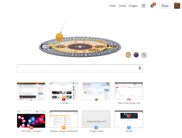
Most of the features of the new tab page have been removed and replaced by a huge Google logo. Chrome apps are in the app launcher, recent tabs are in the Chrome menu.
I've never liked browser homepages, but Chrome's new tab page was really useful. It loaded quickly and had a lot of links to pages you were likely to open. Now it only shows 8 of your frequently visited pages and a fake search box that sends you to the omnibox.

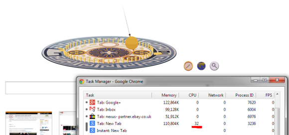
When Google shows an animated doodle, the new tab page shows same the animation and you're forced to see it each and every time you open a new tab. Sometimes the doodle uses a lot of resources:

There are some great extensions that replace the new tab page, but you shouldn't have to use an extension for this. The new tab page should be fast, simple and useful.
Here's a quote from Chromium's site:
"The new tab page is the default starting point for all tabs - it is designed to get the user where they want to go, and is not meant to be an information resource like the user's home page; that is, the new tab page is not intended to be a destination, but rather a jumping-off point to other destinations - we strongly want to avoid cognitive load and distractions for the user, especially those creating new tabs for other purposes."
So it shouldn't include distractions. That's exactly what the Google homepage does and the new tab shouldn't do. Animated doodles, Google+ notifications - all of them are distractions that don't belong in a page you open so often.
For now, I'll switch to the empty new tab page.