1. the new Google navigation interface
2. the updated new tab page
3. Chrome's app launcher
4. the new Chrome apps
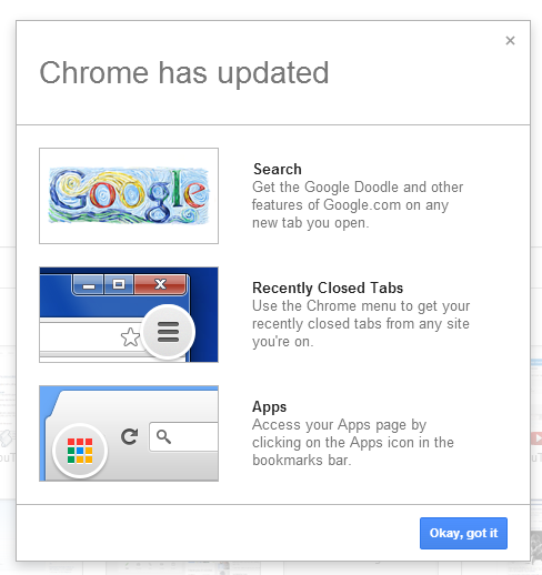
There's an interesting synergy that deserves some explanations. Google's new drop-down menu from the homepage and search results pages looks just like the app launcher, but it only links to Google apps and you can't customize it. Chrome's app launcher was first available in Chrome OS and it's now added to the regular version of Chrome. It includes the apps that were previously available in the new tab page, but it's optimized for a new breed of apps that work offline and look just like native apps. They can be launched from the operating system's taskbar, use APIs that integrate with the hardware, open links in a browser tab. Install any app from this page to enable the app launcher.
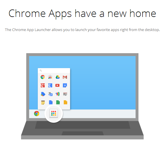
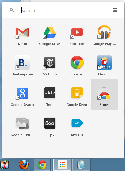
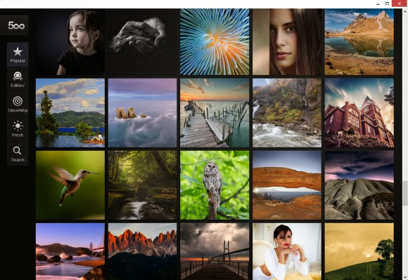
The old bookmark apps have a small arrow just like regular Windows shortcuts and open in a new Chrome tab, the new apps don't have the small arrow and open in a new chromeless window.
Chrome's new tab page has a different goal: teach people to use the omnibox (the unified address bar and search box). Many people type google.com and use the search box from Google's homepage to search the web. Google decided to replace the new tab page with a modified Google homepage that uses the omnibox instead of the regular search box. "While you can search straight from the omnibox in Chrome, we've found that many people still navigate to their search engine's home page to initiate a search instead. The goal is to save people time by helping them search and navigate the web faster," explained Google.
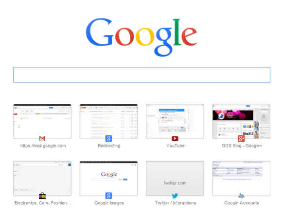
To sum up: the new Chrome apps are no longer bookmarks to websites and no longer open in Chrome tabs, so they're moved outside of the browser. There's a new bookmark called Apps that links to chrome://apps, where you can still find the old apps list. The updated new tab page is an educational feature that tries to simplify the search workflow for regular users.
Advanced users probably don't need it, so here are two ways to tweak the updated new tab page (Google might remove them in the future):
1. How to replace the updated new tab page with a local version that doesn't load Google's homepage and doesn't show doodles? Paste this in a new tab:
chrome://flags/#enable-local-only-instant-extended-api
and click "Enabled" in the drop-down below "Enable local-only Instant Extended API", then click the "Relaunch Now" button at the bottom of the page to restart the browser.
2. How to go back to the old new tab page? Paste this in a new tab:
chrome://flags/#enable-instant-extended-api
and click "Disabled" in the drop-down below "Enable Instant Extended API", then click the "Relaunch Now" button at the bottom of the page to restart the browser.
You can read between the lines and notice how Chrome adds more and more operating system features: it has its own apps, a "start menu" replacement, a notification system, a remote printing feature, support for multiple users and a guest mode.