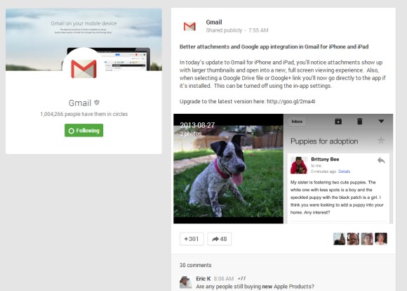
Google+ post pages look different: posts are now moved to the right and there's a huge box that shows the name of the page or author and the number of followers. The new layout encourages people to follow pages and Google+ users, but makes posts more difficult to read.
Here's
an example of post from Gmail's Google+ page.

